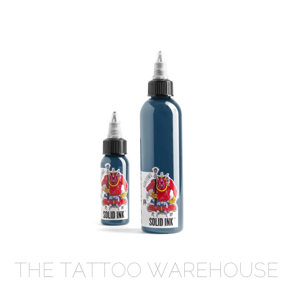
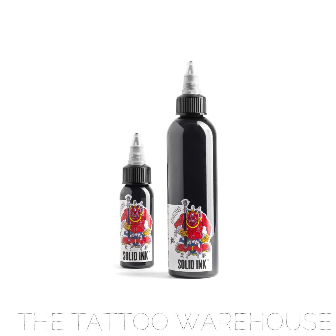
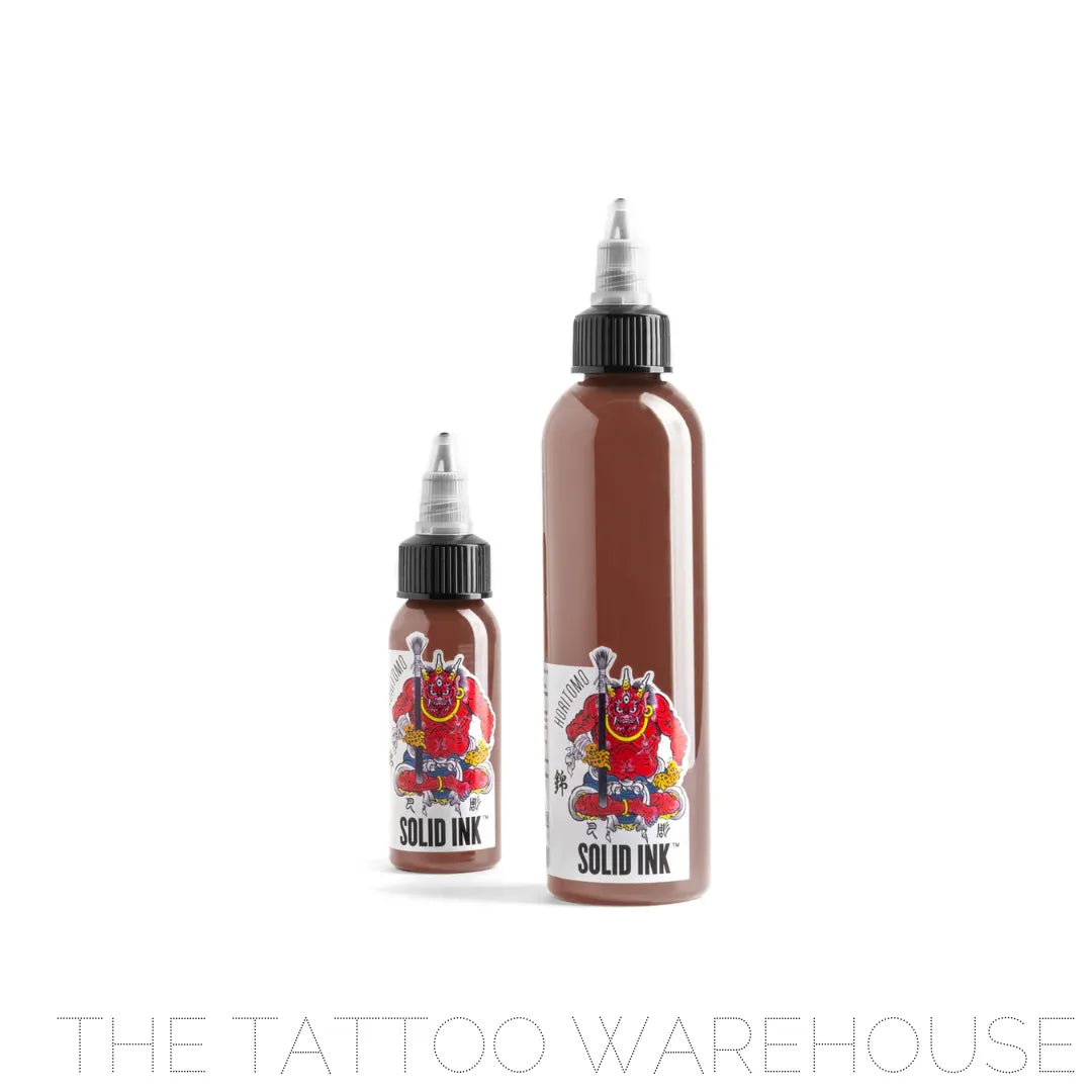
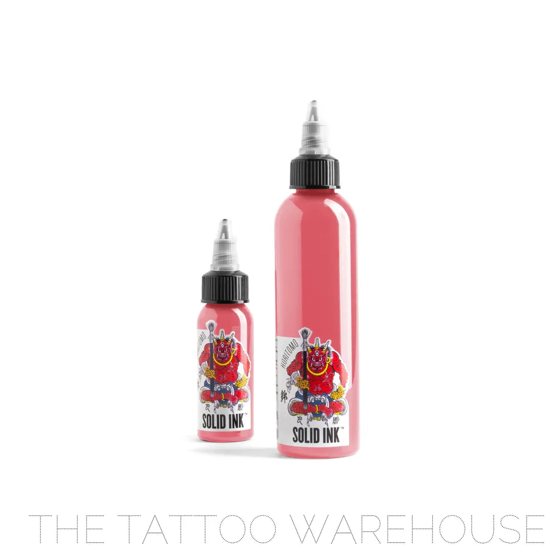
Horitomo 12 Colour Set
Horitomo 12 Colour Set - 1oz is backordered and will ship as soon as it is back in stock.
Couldn't load pickup availability
These tones were developed and tested by Master Horitomo, bringing his extensive experience in traditional Japanese tattooing. This collaboration has resulted in a carefully curated palette, ideal for achieving the perfect colours in Japanese tattoo compositions.
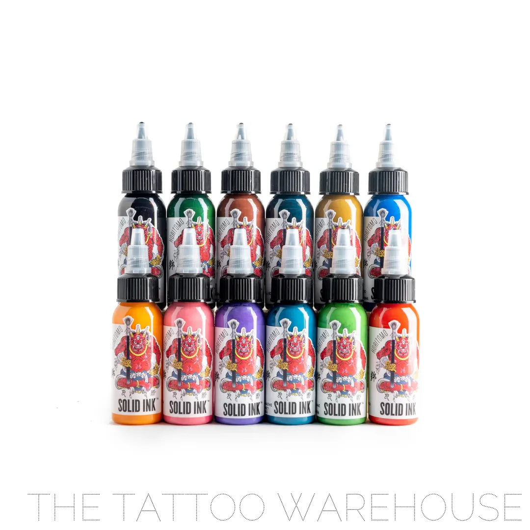
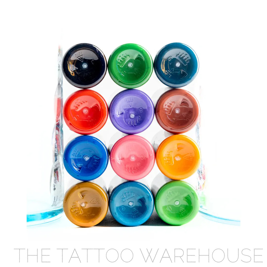
The Horitomo Set includes the following 12 colours:
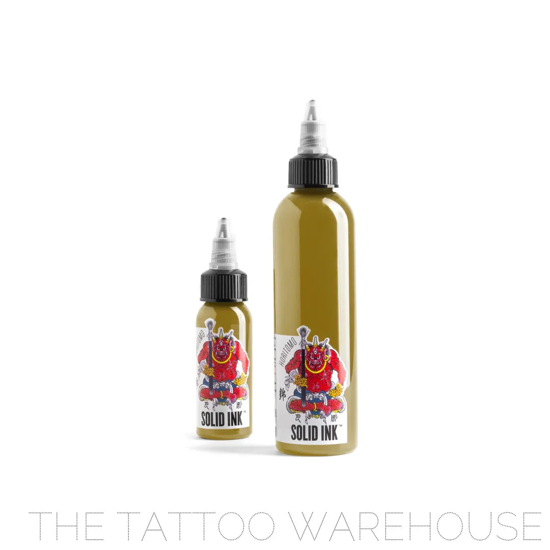
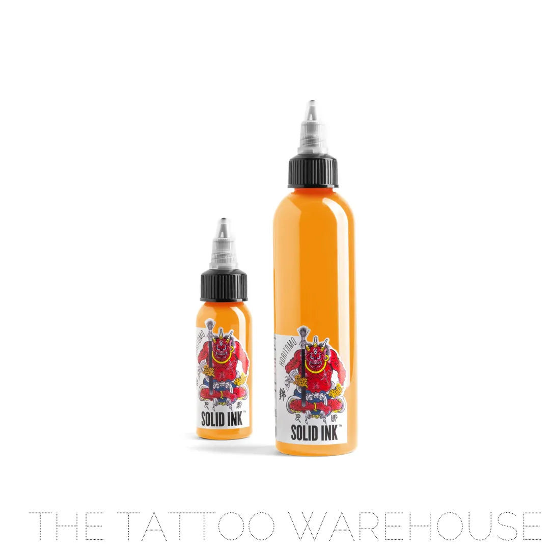
.Odo: This colour is a yellowish brown ochre tone reminiscent of straw and the materials related to woodwork. I would also use these for the clothing of Fujin and Raijin. I like using it when I want a subtle colour tone.
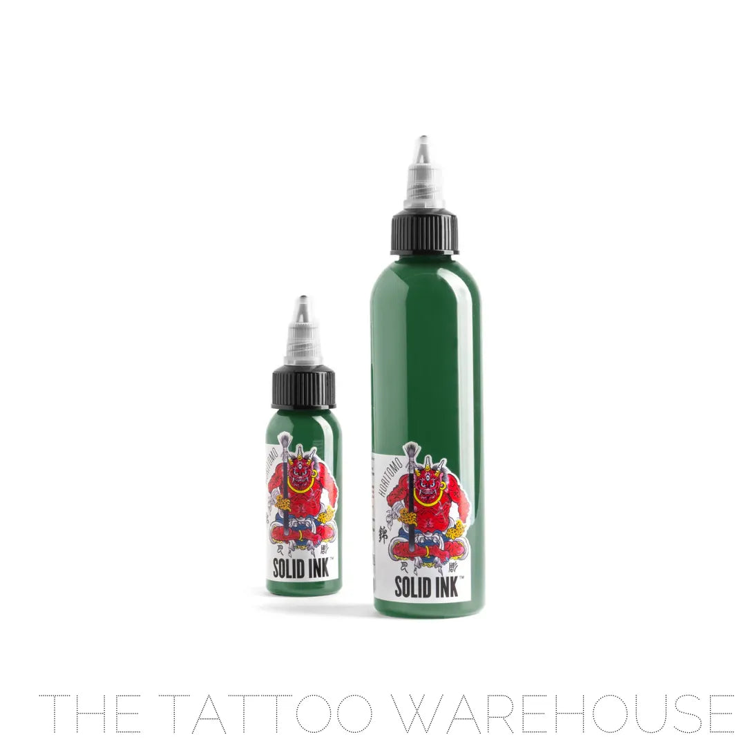
.Moegi: This is a colour that has been used in Japan since the Heian Period (794-1192). In Kabuki Theatre, this is one of the three colors of the final closing curtain. It is a reserved and subtle green. I find it suitable for the base colour of dragons, Fujin, oni, the kimono of samurai, as well as the leaves of kiku (chrysanthemum) and botan (peony).
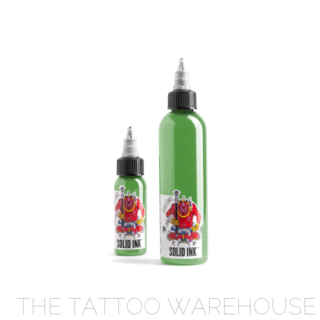
.Wakanae: This light subtle green is based on the colour of young sprouted rice. It is suitable for Buddhist pieces, kimono patterns and the underside of leaves.
.Koji: This reddish yellow is connected to Buddhism in Japan. I think it is a nice base colour for tigers as well as for metal pieces of samurai armour. This goes well with a bright yellow to give an old world ukiyo-e irezumi feel.
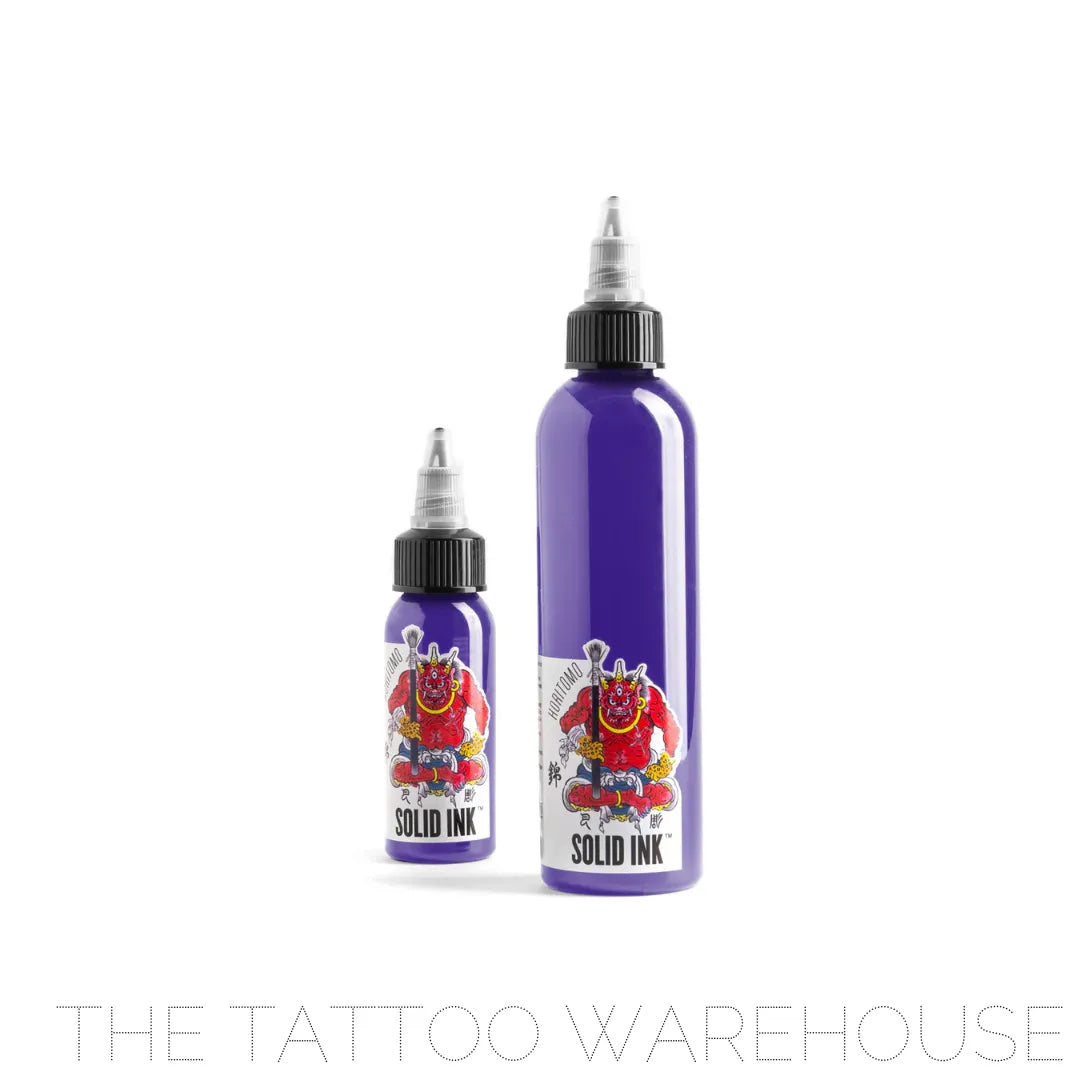
.Kikyo: This colour is derived from the flower of the same name, Kikyo, and has been used since the Heian Era (794-1192). This bluish purple is very dignified and is suitable for the kimonos of samurai and oiran.
.Bengara: This reddish brown color was popularized during the Edo Period (1603-1867). In Japanese irezumi this color has been used for a very long time, since the days when colors were very limited. By using Bengara, Shu and my Sumi Set, you can invoke a very "old world" look and feel.
.Shu: This color exists between red and orange and is a classic color of Japan. In Japanese irezumi this color has been used for a very long time, since the days when colors were very limited. By using Shu, Bengara, and my Sumi Set, you can invoke a very "old world" look and feel.
.Sakura: This pink was created with the cherry blossom flower in mind. In old irezumi, Shu was used for these flowers, but this modern color is more true to the actual color of the iconic Japanese flower and has a softer feel. I also feel it is great for tennyo as well as for the eye shadow on woodblock print style women.
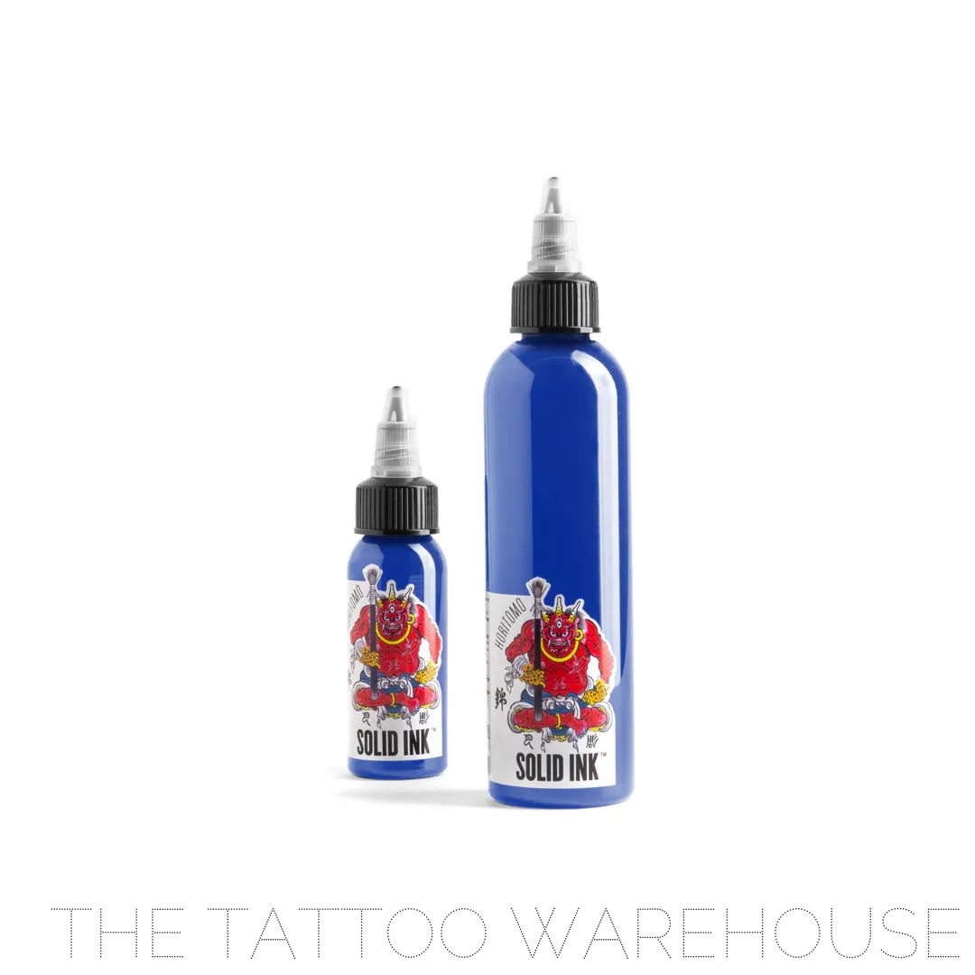
.Shinbashi: Towards the end of the Meiji Era (1868-1912) this colour was popular amongst the geisha of the Shinbashi district in Tokyo. It is a reserved but still bright, blue tone. Aside for its obvious use for kimono color, I feel it works great for yurei (ghosts) and yokai (supernatural creatures).
.Gunjo: This color is a deeper blue, similar to a toned down ultramarine. This colour has been associated with men's clothing for many years in Japan. I like using this for samurai clothing and armour.
.Fudo Blue Black: This colour was based on the colour of the body of Fudo Myo-o. In the Jyu-Kyu Kan text, the skin coloration of Fudo Myo-o is described as blue-black. While there are other colorations of Fudo Myo-o, this particular colour is inspired by that text and I feel is a good, strong colour for Fudo Myo-o.
.Fudo Blue Grey: This colour is meant to be used with Fudo Blue Black. These two colors together can be used to create a powerful Fudo Myo-o. If you desire to create a bit lighter toned, brighter Fudo Myo-o, you can use Fudo Blue Grey as a base and fade it out with a 50-50 mix of Fudo Blue Grey and Solid White
All of our pigments are vegan and cruelty free. Made in the USA.
Ingredients: Aqua CAS #7732-18-5, Pigments, Glycerin CAS #56-81-5, Isopropyl Alcohol CAS #67-63-0 & Hamamelis CAS #84696-19-5
